James Whyte

Unity UI System:
Diecast Scalper
My highest graded artefact from my degree so far is this retained UI System I built from the ground up in Unity showcased through a small demo: Diecast Scalper. I was able to construct a UI system with a clean structure and consistent in-game functionality. The UI system provides the core features required to create a dynamic, interactive UI for a game. I demonstrated the system’s practical viability through the creation of a UI-based gameplay demo.
This was developed in Unity, programmed using C#. Source Code is available at the bottom of the page.

UI System Architecture
The UI components were created using inheritance and polymorphism. The system includes UI elements such as containers, buttons, labels, and progress bars, all of which inherit from a base class UIControl. This class provides the basic variables and functionality of an onscreen UI element, as well as overridable functions that can be adjusted to suit the needs of other UI elements.
Below is a UML diagram that shows the inheritance structure of UI elements.
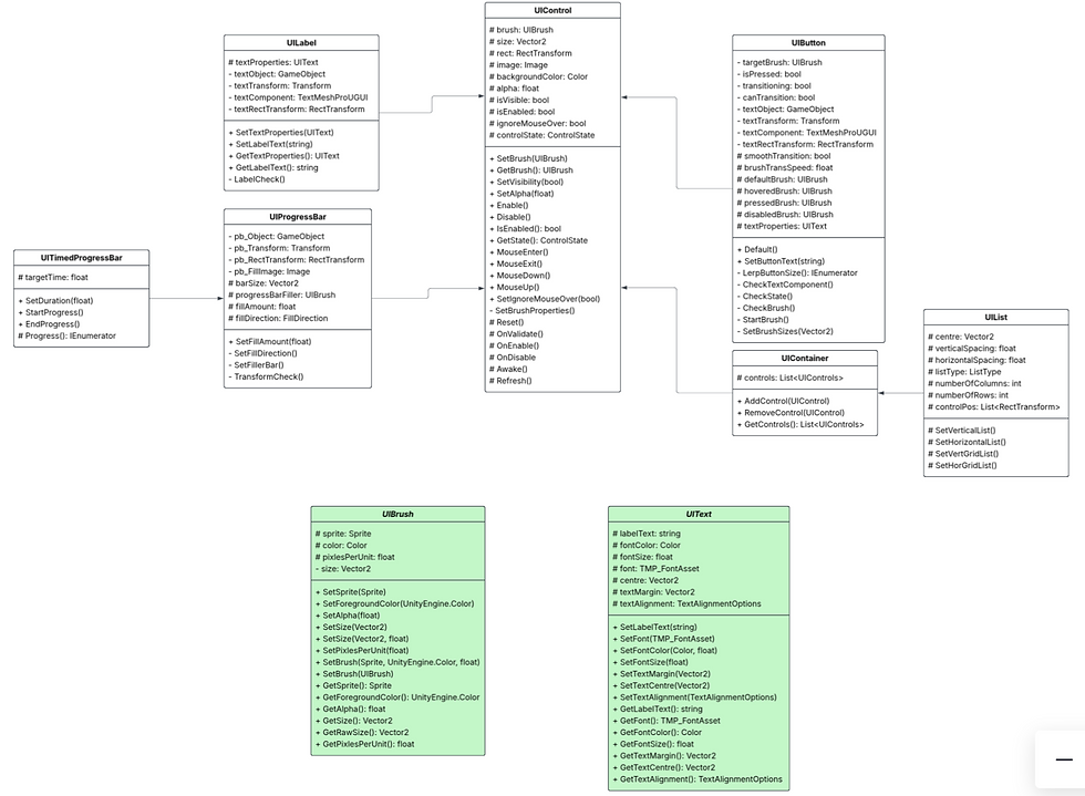
Retained UI System
Interactive UI elements' states are updated via functions and finite-state machines, with states stored as enumerators. This allows the UI system to follow the retained structure whilst being able to update dynamically without the use of any tick method.

The tweening for UI elements such as buttons and timed progress bars was implemented using Unity's IEnumerator. This provides a smooth transition that can be executed when necessary, while avoiding the cost of running a tick method every frame. These IEnumerators are invoked via functions. Below shows the button tweening logic.

To invoke the functions of interactive UI elements, I created a pointer control script. This casts a ray from the mouse's position when the mouse is moved. The ray gets the first UI element it makes contact with and executes the MouseEnter. Mouse interaction triggers the MouseDown and MouseUp functions, and upon leaving the UI element, MouseExit is called. As mouse interaction functions are declared in the UIControl, all UI elements have the ability to interact with the mouse.

UI Elements
The base UI element is the control, this contains a brush as well as interaction functionality.
UIControl

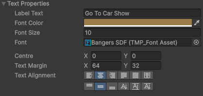
This contains the same properties as the UIControl, he only difference being that it displays text. The text properties such as centre, alignment, and font can all be adjusted.
UILabel

This acts as a container for UI elements, calling functions such as SetVisibility, Enable, and Disable will affect all UI elements in the container
UIContainer

This is a varient of the UIContainer that organises UI elements into a Vertical, Horizontal, or Grid list. Properties such as spacing, centre, and list type can be manually adjusted in the inspector.
UIList


The button contains a brush for its default, hovered, pressed, and disabled states. Different states are applied through invoking the mouse interaction, enable, and disable functions. Smooth or instant transitions between states can be toggled by the user, transition speed can also be adjusted.
UIButton


The progress bar contains a bar and filler brush. The direction of the filler can be changed in the inspector, Progress can be added by invoking the SetFillAmount function.
UIProgressBar

The timed progress bar progresses at a constant rate defined by it target time. This inherits the same functionality as the normal progress bar, however removes the functionality of SetFillAmount to avoid any overwriting of the progress.
UITimedProgressBar

Abstract Classes
The abstract classes contain data that define common properties of the UI elements. The variable's protection level in these classes are protected and can only be accessed in the editor; however, each class contains public setters and getters to adjust their values. The classes also contain a constructor and empty constructor that can be used to instantiate a new properties in code.
This contains the basic components of a brush that can be used display an image. This includes a sprite, color, and pixels per unit.
UIBrush

This contains the basic components required to display text. This includes variables such as string, alignment, and font properties.
UIText